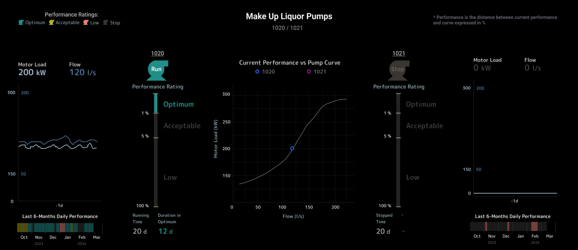
This dashboard is aimed to fulfill the monitoring need: "If you get outside of the ideal performance area, flag it"
In this use case, there's a pair of redundant pumps, and users need to be aware when they are underperforming.
The below visualization is build-able in OSIsoft PI Vision
Please, let me know any thoughts.