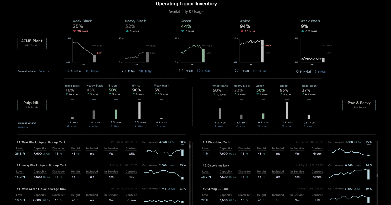
This dashboard design helps track the availability and usage of chemicals in a Kraft pulping operation.


This dashboard is build-able in AVEVA PI Vision


Please, let me know any thoughts.


Abel

Parents
  • Hi Mathew,


    A visual design like the one in this post is mainly based on techniques that help visual perception: Use of contrast (in addition to just color), alignment, form (i.e. tank bars), some gestalt principles (proximity, closure, connection), and reducing visual noise as much as possible. In the backend, it's standard PI Tags and AF analytics to support the design.


    It's a "design-first" approach; and then PI has the backend necessary to support the design


    Please, let me know any more comments/questions

Comment
  • Hi Mathew,


    A visual design like the one in this post is mainly based on techniques that help visual perception: Use of contrast (in addition to just color), alignment, form (i.e. tank bars), some gestalt principles (proximity, closure, connection), and reducing visual noise as much as possible. In the backend, it's standard PI Tags and AF analytics to support the design.


    It's a "design-first" approach; and then PI has the backend necessary to support the design


    Please, let me know any more comments/questions

Children
No Data