I want to show a bar chart comparing monthly losses in two years. As follows:

I want to show a bar chart comparing monthly losses in two years. As follows:

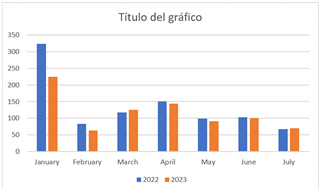
Hi Carmen, yes this is possible. What I would do is create a new attribute in AF and let it show the data from one year ago. So you have the same data but shifted by one year.
Then you can use for example our stacked bar chart and set it to monthly aggregation and with that you can then see the direct comparision.
You can see an example below:

How can I set it to monthly aggregation?
Hi, you can do that pretty easily with Combo Chart Plus for PI Vision, see the example screenshots: https://www.software-athlete.com/products/combo-chart-plus